
Company:
Uline
Year:
January 2025 - May 2025
Duration:
5 Months
Overview
Uline is a B2B (business to business) supplier known for its wide selection of shipping materials and industrial supplies. Their customers are primarily corporate buyers who often purchase in bulk. As a part of Purdue's UXD Experience Studio, our team was tasked with identifying usability issues on Uline’s current Product Detail Pages (PDPs) and creating a redesigned version that better aligns with user needs and expectations. 📝💡🌐
🎨Click to view - Figma File
🔍Click to view - Documentation Master Copy
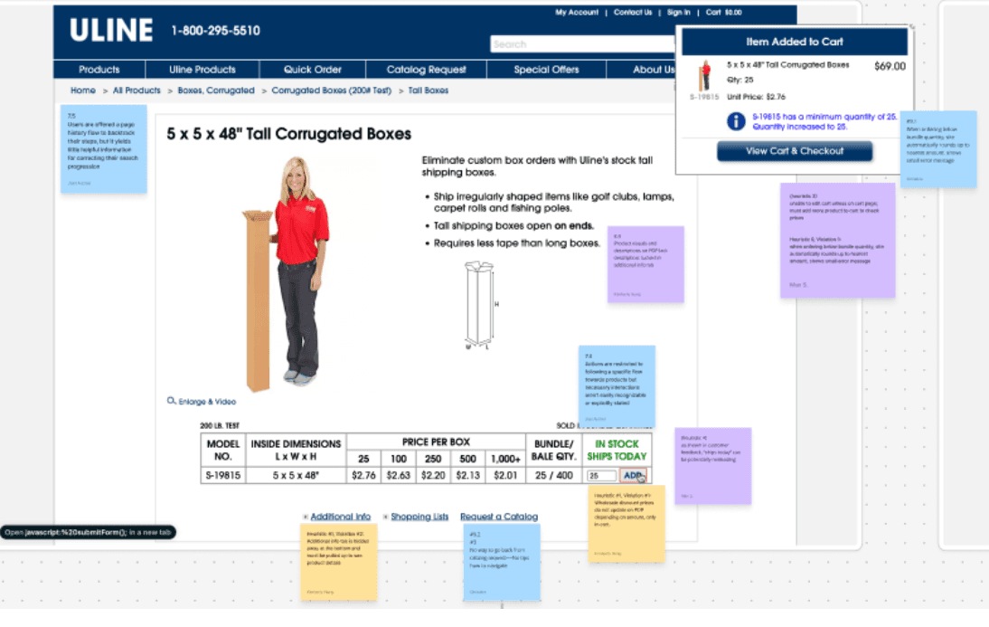
The Original Design
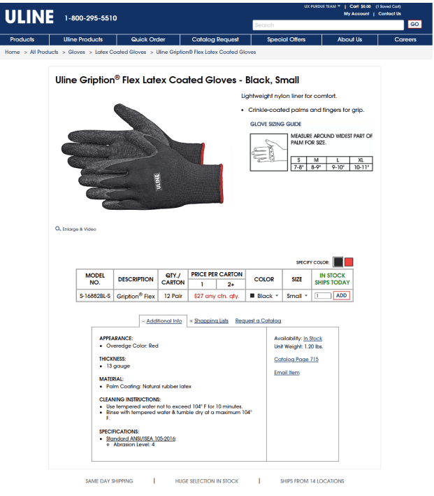
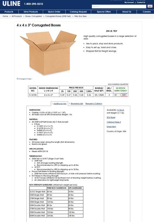
Users faced friction due to:
📄 Hidden or inconsistent info: Specs and shipping details were difficult to locate.
💰 Confusing pricing & quantity: Bulk pricing unclear and quantity selection caused errors.
🛒 Misleading Add button: Users expected it to add items to the cart, but it only increased quantity.
📱 Poor mobile experience: Key details were missing or hard to read on small screens.
🔍 Overcomplicated Additional Info tab: Important info was buried and often overlooked.
🎯 Primary users: B2B buyers such as shipping managers, lab safety officers, and makerspace managers.
How we tackled this project🛠️🔍🎨
We built a full research roadmap including:
✔ Secondary Research
✔ Heuristic Evaluation (Nielsen’s 10)
✔ Cognitive Walkthrough (desktop + mobile)
✔ Affinity Diagraming
✔ Usability Testing
✔ Interviews
✔ Copy-to-Learn analysis
✔ Crazy 8s
✔ Paper Sketching
✔ Low-Fidelity Wireframes
✔ High-Fidelity PDP Prototype
✔ Synthesis & Recommendation Report
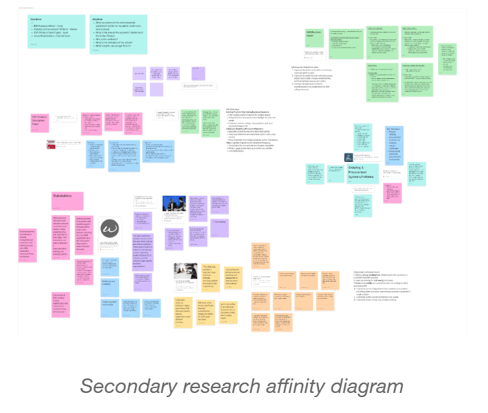
Secondary Research🔍
We studied:
B2B ecommerce behaviors
Uline’s catalog
Bulk order psychology
Industry best practices for PDP design (Grainger, Fastenal, Amazon Business, Staples)
Key themes from secondary research:
Business buyers prioritize speed over browsing
Reorders are common
Specs must be extremely clear
Price transparency is mandatory
Shipping consistency is a trust factor
Mobile orders are increasing
This helped us frame our research questions for live user studies.
Heuristic Evaluation (Nielsen’s 10)📝
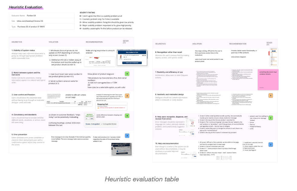
Cognitive Walkthrough (Desktop and Mobile)🧠👣
Problem areas uncovered from Heuristic Evaluation and Cognitive Walkthrough:
Add to Cart & Error Handling: Hard to find, forced quantity changes, poor feedback
Navigation & Page Flow: Rigid flow, unclear navigation, missing hierarchy
Product Information & Presentation: Hidden details, vague descriptions, misleading availability
User Guidance & Help: Missing error messages and tooltips
Interaction & Visual Design: Poor hierarchy, small/missed UI elements, extra clicks
Takeaways:
Make the Add to Cart option clearly visible
Organize information to match user needs
Standardize formatting: text size, color, spacing for readability
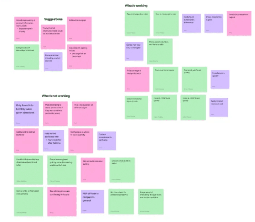
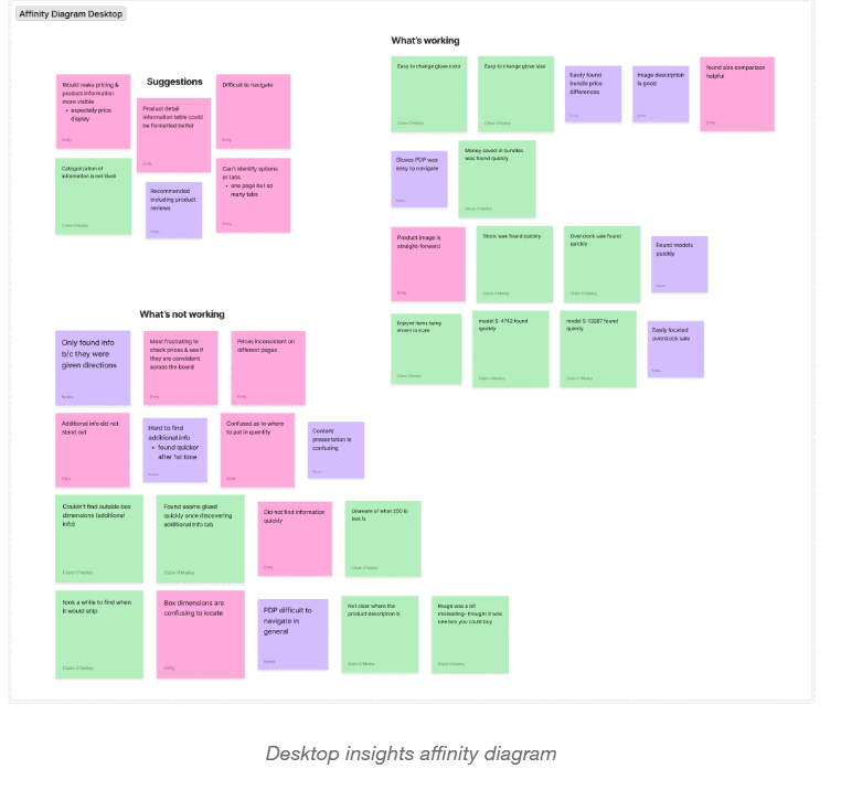
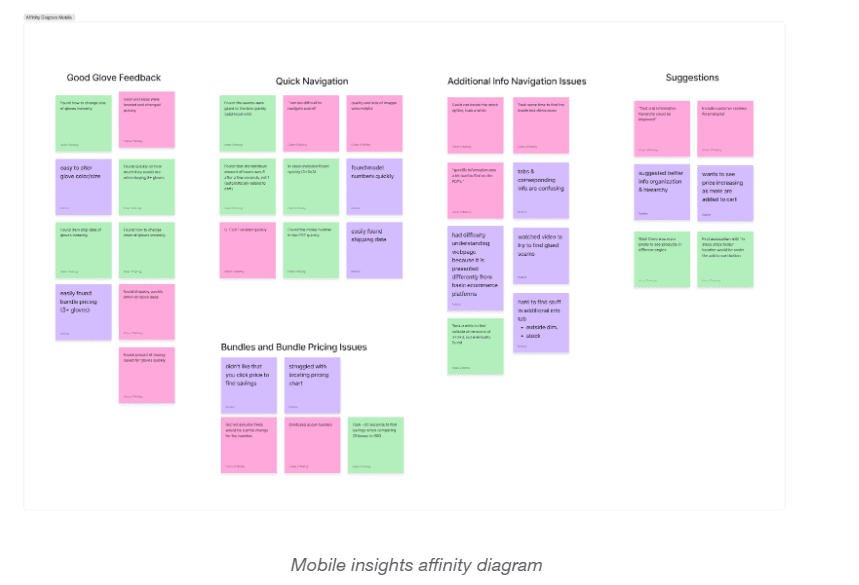
Affinity Diagramming (Customer Reviews)🗂️
We analyzed dozens of customer comments and our walkthrough data, grouping them into patterns.
Five recurring themes emerged:
Misleading or outdated information
Missing product details
Confusing navigation
Visual clarity issues
Lack of safety or usage warnings
These themes directly shaped our redesign priorities.
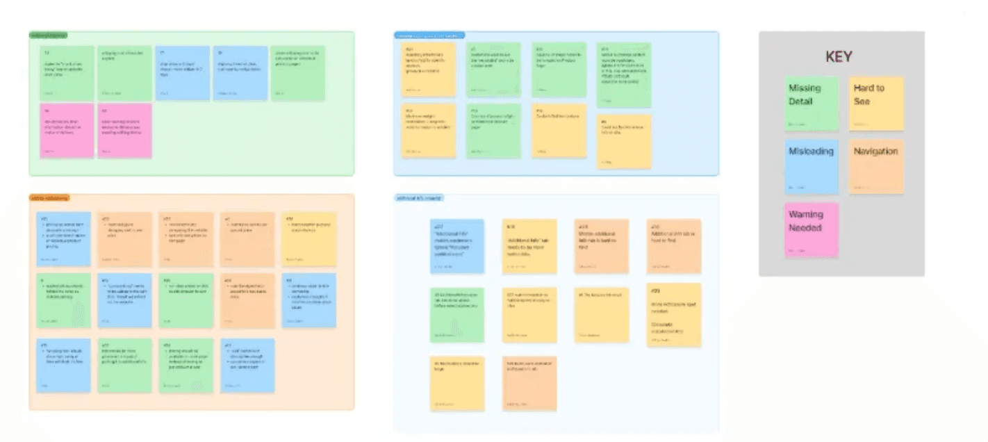
Usability Testing Overview🖥️📱
Tests Conducted: 6 sessions (3 desktop, 3 mobile) with classmates; 2 experienced Uline users, 3 new users
Tasks: Product search, pricing, selecting options, and understanding bundles (e.g., find model S-13287, check overstock savings, choose glove color, calculate bundle savings)
Desktop Insights 💻
Important details in the Additional Information tab were hard to find
Add to Cart button felt hidden
Bundles and pricing caused confusion
Content felt cluttered
Scale comparison images were very helpful
Mobile Insights📱
Users wanted customer reviews for validation
Text was hard to read
Scale comparison images remained helpful
Bundle purchasing system caused confusion
User Interviews (3 B2B Professionals)🗣️👥
Interviewee 1 — Lab Safety Officer (16 yrs)
Uses Uline across multiple institutions
Buys gloves, PPE, chemicals
Values safety docs and spec accuracy
Frustrated by hidden SDS sheets and incomplete details
Interviewee 2 — Shipping Manager (2+ yrs)
Orders boxes, tape, industrial supplies
Wants clear shipping deadlines
Needs accurate dimensions
Often cross checks orders with procurement platforms
Interviewee 3 — Makerspace Manager (1+ yr)
Orders a wide variety of materials
Relies heavily on search
Wants better filtering by size, color, material
Finds additional info hard to locate
Interview Themes
🔍 Search & Navigation
Experienced users rely on search; new users depend on categories
Filtering is difficult and often ineffective
Additional Info tab frequently overlooked
📦 Product Information & Hierarchy
Specifications need clear grouping
Price breaks should be visible upfront
Users want clearer warnings and materials info
🛒 Ordering Process
Quantity rounding causes frustration
Discounts only appear too late
⭐ Preferences
Next day shipping highly valued
Delays without communication are frustrating
Free promotional items appreciated
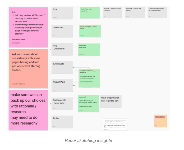
Starting the Design Process🎨📝💡
Copy-to-Learn Workshop✏️
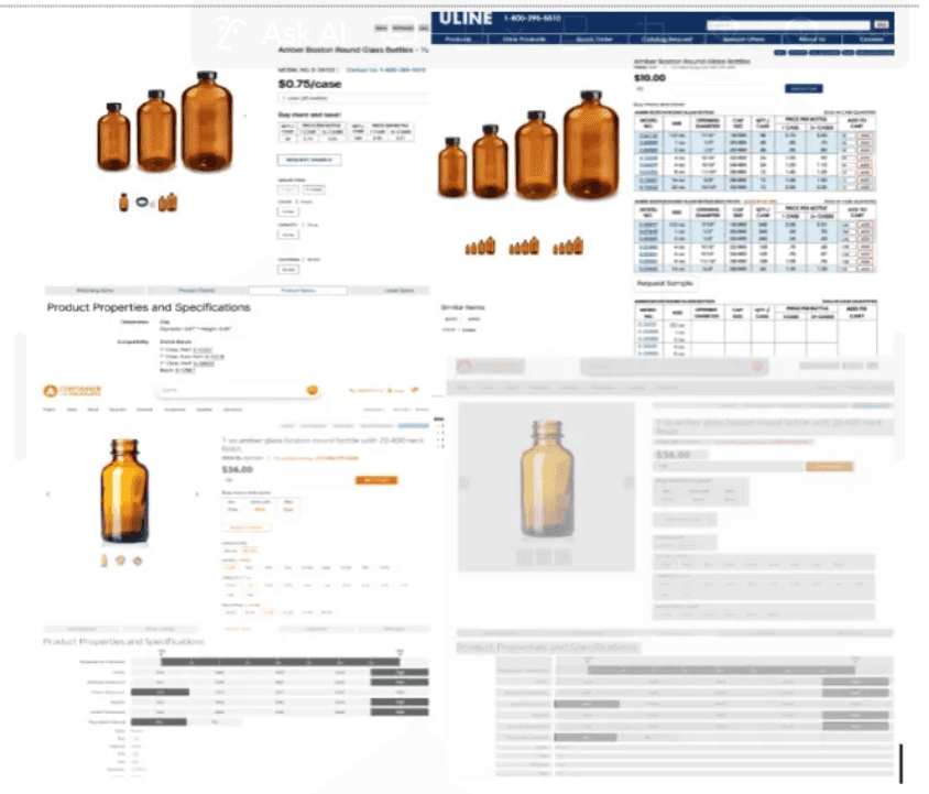
We rebuilt competitor PDPs in Figma to identify:
Layout patterns
Presentation styles
Price table structures
This strengthened our pattern vocabulary and revealed effective competitor layouts.
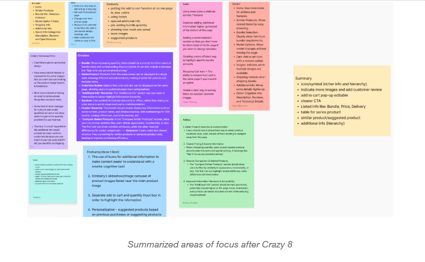
Crazy 8 Sketching✏️
Crazy 8 is a rapid ideation technique where participants sketch eight different design ideas in eight minutes. Each idea is drawn within one minute, pushing for quick and diverse solutions. Rapid ideation revealed ideas and patterns in improving hierarchy, comparison, and visual communication, which we expanded through paper sketches before moving to digital prototypes.
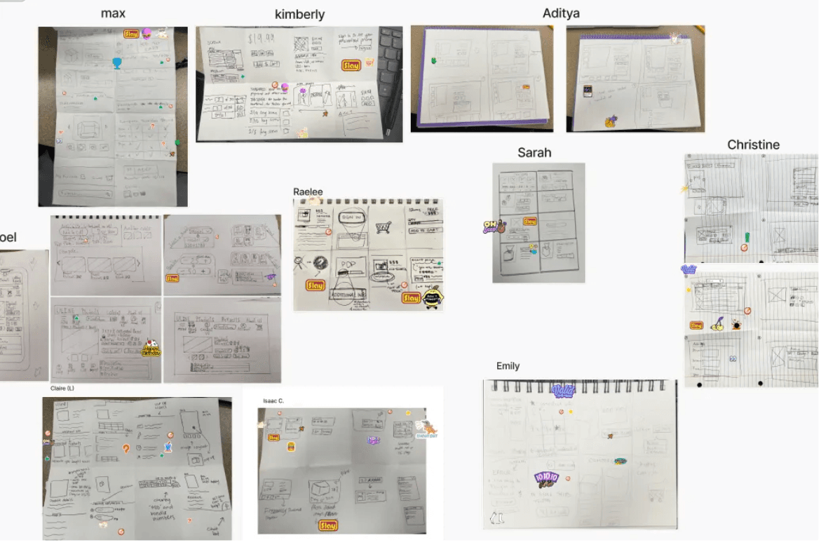
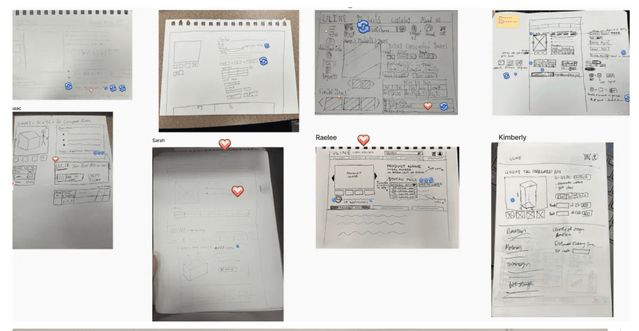
Paper Sketching✏️
During paper sketching, we translated the most promising ideas into full page wireframes, experimenting with layout and visual hierarchy. This allowed us to explore different ways of organizing content and to identify the key features to prioritize for the initial mock-up.
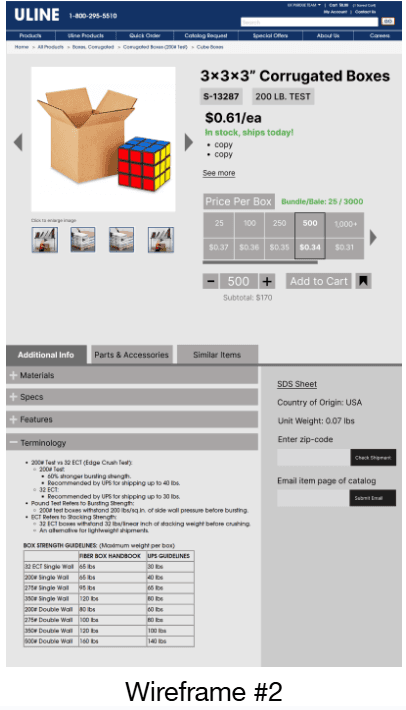
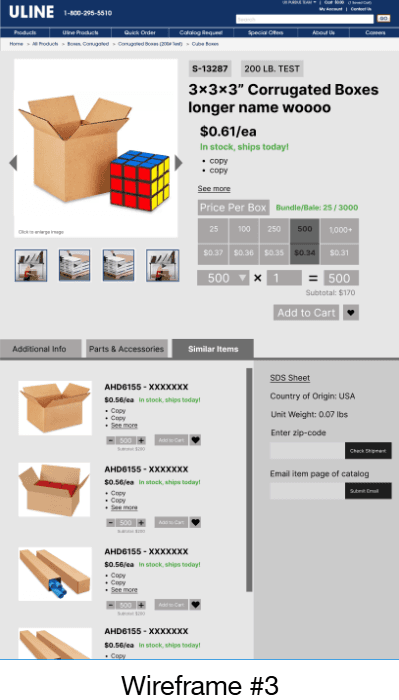
4. Wireframing in Figma🖊️📐💻
We used Figma to create low fidelity wireframes based on our paper sketches.
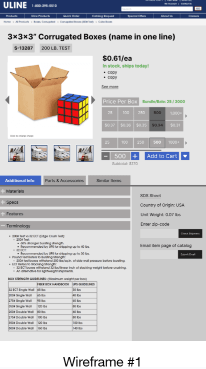
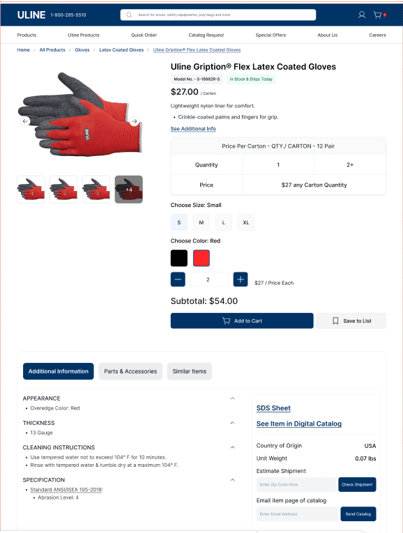
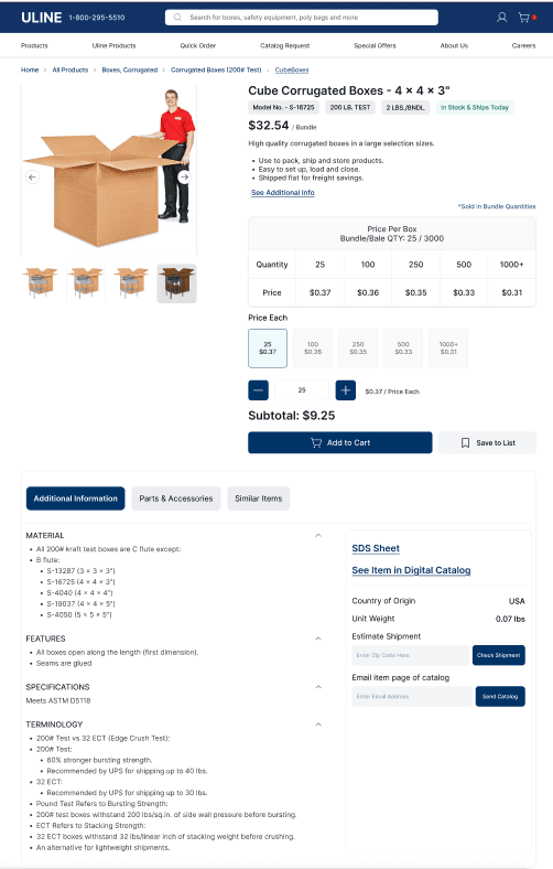
High Fidelity Prototype (Hi-Fi)🎨✨
Key Features of the Redesign:
📌 Additional info link centralized on the page
💰🛒 Redesigned pricing chart near the Add to Cart section
👀 More visual pricing features for easy scanning
🔢 Redesigned quantity input field
📝 Subtotal features for quick tracking
⭐ Add to List bookmark for favorites
📚 Page catalog referencing info
🚚 Additional shipping info highlighted
🔄 Recategorized Additional Info tabs for smoother navigation
Usability Testing: Redesign vs. Original👀
Purpose: Evaluate whether the redesigned PDP is more intuitive, efficient, and effective than the original.
Method: Mixed-method testing with A/B comparison and structured tasks using two products. Participants completed realistic tasks like finding model numbers, stock status, pricing, and adding items to a saved list.
Participants: 2 Uline B2B users familiar with the website
Key Measures:
Task success, navigation paths, errors
Ease of navigation, intuitiveness, and efficiency (1–5 scale)
Think-aloud feedback and open-ended impressions
Focus Areas: Information hierarchy, navigation clarity, and overall user satisfaction
Results — 35% improvement across all categories📈✅🎯
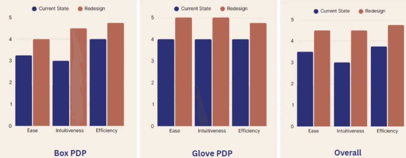
Key Improvements & Impact✨
🔄 Users backtracked less and navigated more efficiently
📖 Reading clarity improved with better information hierarchy
🏠 Layout felt familiar but much cleaner
✅ Decision confidence increased; frustration reduced
⏱ Task completion was 35% faster on average than the original pages
💰 Pricing and product information clearer, supporting faster decision-making
📤 Design approved for handoff to Uline stakeholders
Next Steps🚀
Beta test with real Uline customers
Expand redesign to mobile
Refine bundle logic and procurement integration
Add comparison tools and incorporate reviews
My Contributions 👩💻
🔍 Research: Interview protocols, interviews, usability testing, heuristic evaluation, cognitive walkthroughs
🎨 Design: Copy-To-Learn, Crazy 8, Sketches, Low-fi, Hi-Fi
🤝 Collaboration: Facilitation of multiple weekly sponsor presentations, full documentation, final project presentation
Reflection💭
Strengthened skills in UX research, B2B design, and synthesizing complex data
Learned to design scalable, brand-aligned systems
Improved communication of design decisions
Reinforced that PDP improvements are about user experience, clarity, and confidence, not just layout


