
Company:
Microsoft
Year:
August-December 2025
Duration:
5 Months
Overview
Redesigning enterprise documentation and analytics tools used by 20,000+ clients 📊
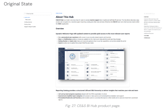
Microsoft’s CE&S BI (Customer Experience & Success Business Intelligence) team helps enterprise clients turn complex data into actionable insights. We focused on redesigning two core platforms: CE&S BI Docs, the main entry point for learning about products and access, and CE&S BI Hub, a centralized reporting environment housing Power BI dashboards.
Through Purdue University’s UX Design Experience Studio, we partnered directly with Microsoft to improve usability, discoverability, and visual clarity, while creating a scalable, accessible design system. This real world project involved authentic constraints, stakeholder collaboration, and deliverables ready for implementation.
Our work is being implemented by Microsoft, delivering real impact for real users 🌟
Project Scope and Constraints 🧩
The project was shaped by several constraints:
Limited access: Research and design were based on provided documentation, screenshots, walkthroughs, and stakeholder input.
Brand and accessibility: All designs had to follow Microsoft brand standards and WCAG accessibility guidelines.
Scalability: Solutions needed to support future growth and evolving documentation needs.
Time constraints: The semester timeline required prioritizing the CE&S BI Docs redesign as the main focus. As a result, the CE&S BI Hub deliverable was mid-fidelity, emphasizing usability improvements and core layout rather than fully polished screens.
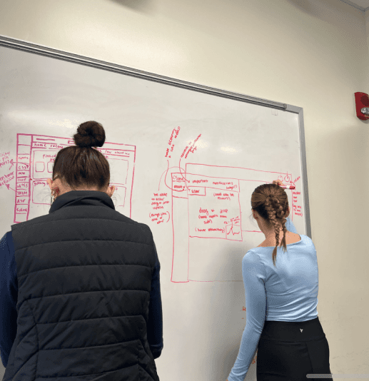
Team Structure and Collaboration 🤝
A multidisciplinary UX student team completed the project over a full semester. We worked closely with Microsoft stakeholders through weekly meetings to ensure our designs aligned with their expectations and needs.

Understanding the Project 🔍
We redesigned two CE&S BI (Customer Experience & Success Business Intelligence) platforms:
CE&S BI Docs
The main entry point for users. Navigation was confusing, content was text heavy, and key actions were hard to find.
Our main focus this semester. Deliverables included high-fidelity designs with a polished style guide, interaction patterns, and visual updates.
CE&S BI Hub
A reporting portal with Power BI dashboards. Users had to remember terminology and follow rigid workflows, which slowed daily tasks.
Due to time constraints, the final deliverable was mid-fidelity, focusing on usability improvements and core layouts rather than fully polished screens.
Milestone 1: Research & Evaluation 🔍
Milestone 2: CE&S BI Docs Website Revamp 🧭
Milestone 3: CE&S BI Hub Revamp 📊
Milestone 1: Research & Evaluation
Overview
The first milestone of our project focused on immersing ourselves in the Microsoft Customer Experience & Success (CE&S) Business Intelligence (BI) ecosystem. Our goal was to understand the current state of the CE&S BI web applications, identify usability challenges, and uncover opportunities to enhance discoverability, visual consistency, and overall user experience. This research phase laid the foundation for all subsequent design work.
🎯Milestone 1 Goals
Gain a deep understanding of Microsoft CE&S BI’s mission and product ecosystem.
Identify pain points, usability concerns, and opportunities for improvement in CE&S BI Docs and the CE&S BI Hub.
Explore industry best practices in UX, accessibility, and visual design to guide redesign decisions.
🔍 Research Activities
Desk Research
Heuristic Evaluation
Contextual Analysis
Cognitive Walkthrough
Subject Matter Expert Interview
Desk Research
We conducted an exploratory review of literature and articles to build foundational knowledge about usability and accessibility standards within customer experience (CX) and business intelligence (BI) web applications. Our approach included analyzing six core resources on usability and accessibility in CX/BI platforms and three supplementary sources focused on grid systems, design systems, and landing page design.
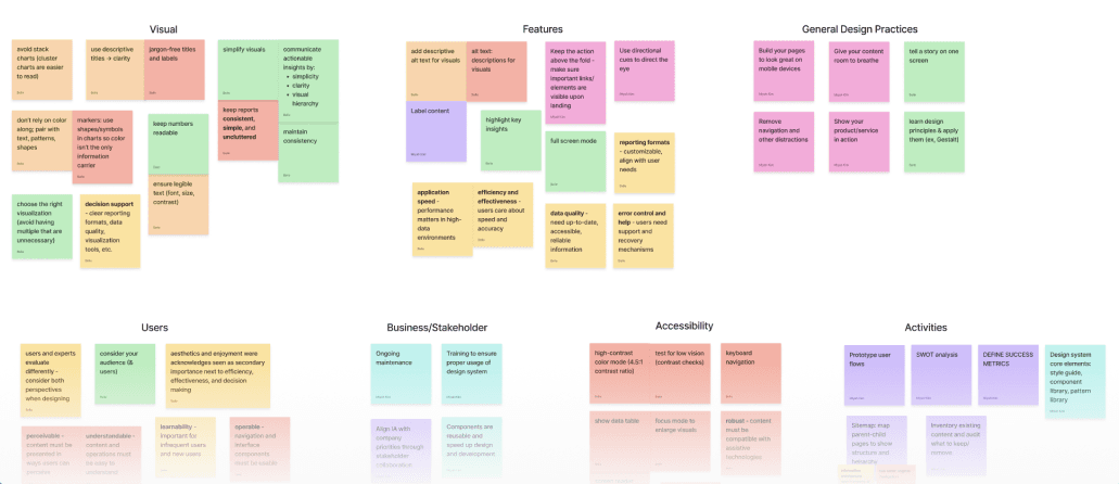
Key Takeaways:
Accessibility & Usability: Following WCAG 2.1 principles and using inclusive design elements improves user experience. Organizing content around user goals makes platforms more intuitive.
Dashboard Visualization & Design: Clear presentation of insights, strong visual hierarchy, and simplified layouts support fast, effective decision making.
Consistency & Structure: Cohesive landing pages, consistent design systems, and well structured layouts streamline both development and user comprehension.
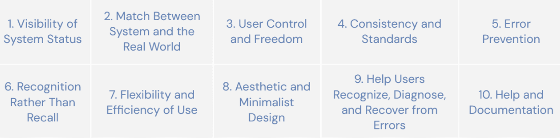
Heuristic Evaluation 📝
We applied Nielsen’s ten usability heuristics to evaluate the CE&S BI Docs website and the user journey to access the CE&S BI Hub. The goal was to identify usability issues systematically and ensure that the platforms supported intuitive, consistent interactions.
Key Findings:
Navigation: Users encounter scattered shortcuts, redundant links, and inconsistent pathways, making it difficult to locate resources efficiently.
Text Heavy Design: Dense blocks of text and unclear acronyms impede comprehension. Critical instructions and hub information are buried.
Visual/Design Elements: Monotone colors, limited iconography, and minimal hierarchy reduce engagement and clarity.
Documentation: While available, guides are often buried and difficult to access.
Guidance and Recovery: Lack of onboarding, error prevention, and support features creates frustration for users trying to recover from mistakes.
Recommendations:
Introduce clear entry points, consistent shortcuts, and navigation tools like a back-to-top button to improve efficiency.
Break up information with visuals, interactive elements, and summaries to reduce cognitive load.
Use icons, calls-to-action, and color to create visual cues and guide user behavior.
Highlight FAQs, troubleshooting steps, and quick guides to enhance confidence and reduce errors.
Contextual Analysis🔎
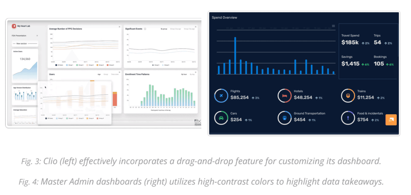
We analyzed 4 comparable web applications suggested by our sponsors to uncover industry design patterns and common pain points. The analysis focused on Information Architecture, Visual Design, Interactivity, and Usability.
Key Takeaways:
Visual Communication: Effective apps use colors and icons to highlight key information and guide navigation.
Customization & Filtering: Platforms offer drag-and-drop dashboards, collapsible sections, and alternative dataset views to allow users to tailor their experience.
Interactivity: Hover and click interactions reveal additional information and improve user engagement.
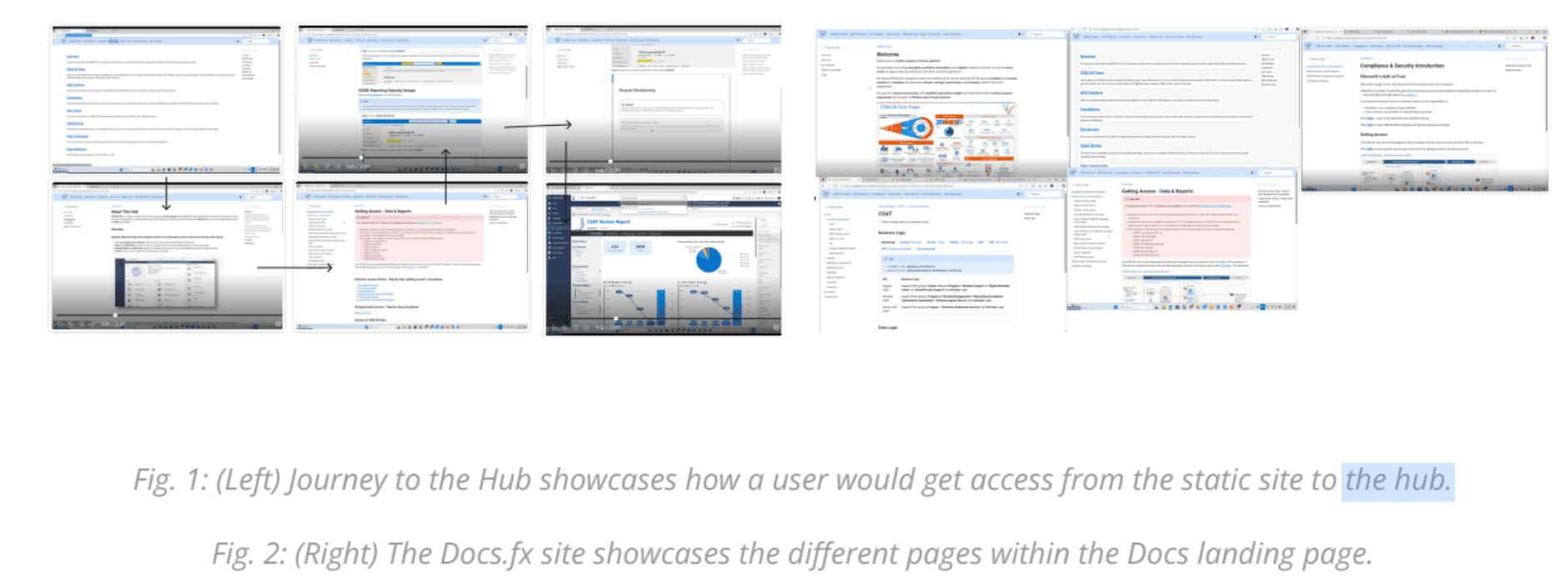
Cognitive Walkthroughs🧠
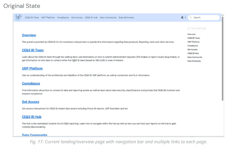
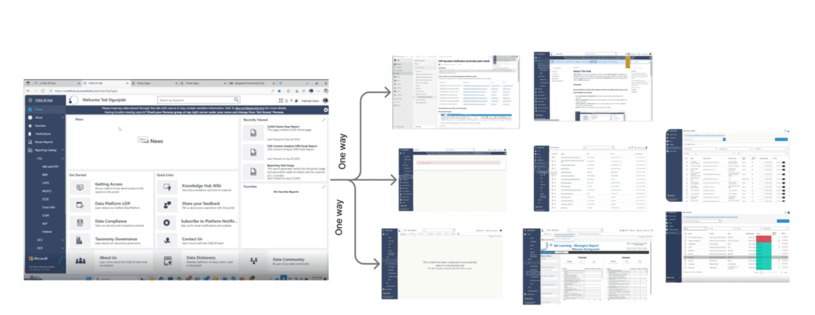
Without direct access to the platforms due to security constraints, we conducted cognitive walkthroughs using step-by-step screenshots provided by our sponsors.
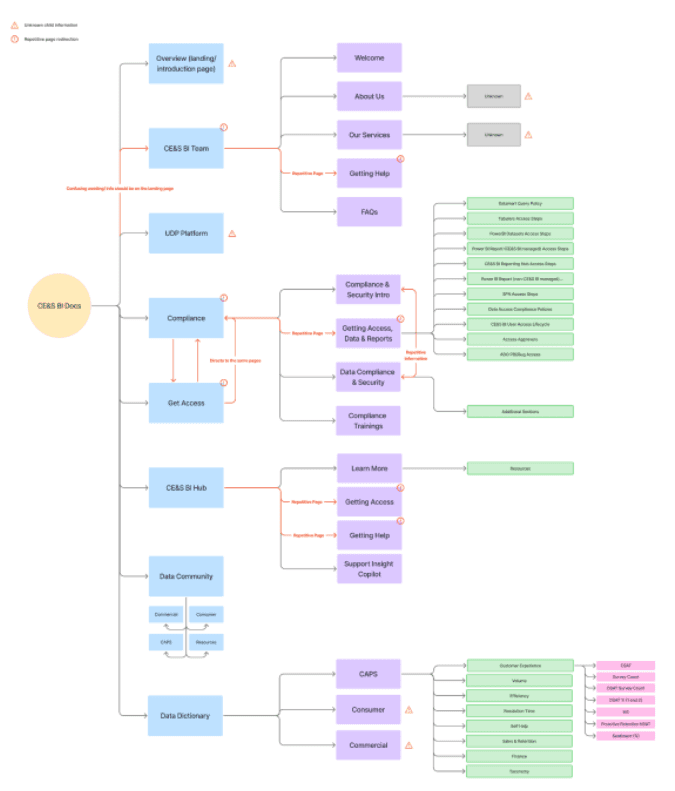
Findings:
Repetitive Information: Multiple pages contain redundant links and navigation elements.
Lack of Annotations: Screenshots lack contextual explanation, leaving users unsure of relevance.
Minimal Visual Design: There is limited use of color, icons, or hierarchy to guide users.
Subject Matter Expert Interview🧑💼
We interviewed Austin Jin, a Subject Matter Expert on Microsoft brand guidelines, to understand CE&S BI branding practices and constraints for our designs.
Insights:
Design Team: A virtual team within CE&S BI will implement our designs, emphasizing the need for a standardized, scalable system.
Creative Freedom: We were granted full creative freedom while adhering to accessibility standards.
Standardization Need: Current dashboards lack visual consistency, highlighting the importance of a unified design system.
Accessibility: Inclusive design remains non negotiable.
📌 Milestone 1 Summary
Activities Conducted:
Desk Research
Heuristic Evaluation
Contextual Analysis
Cognitive Walkthrough
SME Interview
Major Takeaways:
Navigation: Users need clear entry points, a strong landing page, and consistent shortcuts to navigate efficiently.
Information Architecture: Reducing repetition and organizing content hierarchically will improve discoverability.
Accessibility: Applying WCAG 2.1 and inclusive design ensures equitable experiences for all users.
Visual Identity & Branding: Enhancing color, iconography, and hierarchy strengthens usability and reflects Microsoft’s brand identity.
Through these research activities, we built a comprehensive understanding of CE&S BI’s users, products, and challenges, setting a solid foundation for creating thoughtful, user-centered redesigns.
Milestone 2: CE&S BI Docs Website Revamp ✨
For our second milestone, we focused on redesigning the CE&S BI Docs website. Our goal was to create a modern, user-friendly, and scalable interface that improved usability, navigation, and visual clarity while providing a development ready prototype for Microsoft engineers.
Project Goal 🎯
To deliver a high-fidelity prototype of the redesigned DocFX website, including HTML/CSS code, design documentation, and a refreshed logo, ensuring easy implementation and alignment with Microsoft’s brand and accessibility standards.
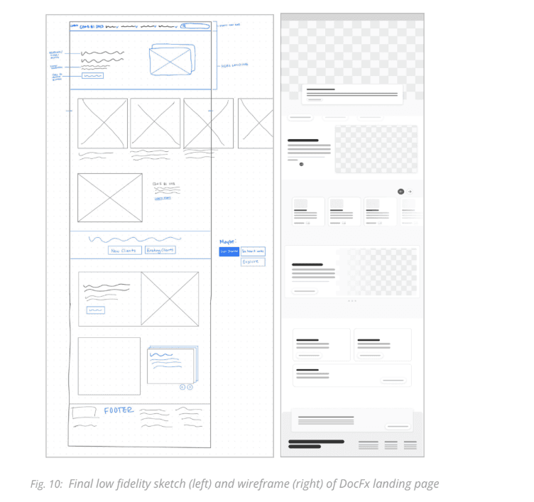
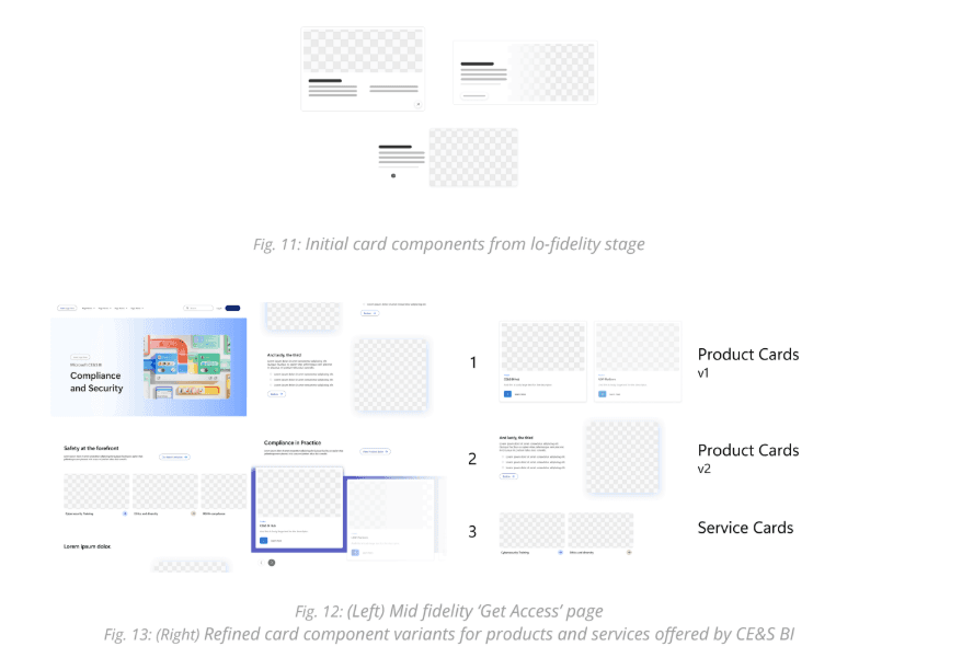
Sketching & Low-Fidelity Wireframes ✏️
We started with early sketches and low-fidelity wireframes to explore layout, content organization, and user flow. The landing page was our primary focus since it sets the foundation for navigation and overall visual hierarchy.
We drew inspiration from industry leading platforms like Confluence, Asana, Microsoft Education, and Robinhood. Each team member sketched independently, then we consolidated ideas to identify recurring and innovative patterns.
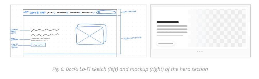
Key Features Identified:
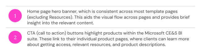
Hero Section: Introduces the platform and sets the tone for navigation.
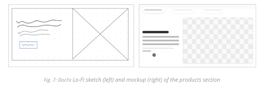
Products Section: Highlights the three CE&S BI web applications, improving discoverability.
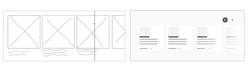
Services Carousel: Interactive browsing of services to maintain engagement and balance content.
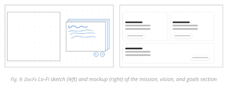
Mission, Vision & Goals Section: Reinforces brand alignment and context for users.
These low-fidelity designs helped define structure, spacing, and information flow while laying the groundwork for a component library to ensure scalability across all pages.
Mid-Fidelity Wireframing 🖌️
Next, we refined layouts and created a mid-fidelity prototype to test interactions, visual hierarchy, and brand consistency. We developed reusable components such as cards, carousels, and CTAs, which allowed us to:
Envision users’ mental models for navigating the platform.
Validate visual and functional alignment with Microsoft CE&S BI’s brand.
Prepare for usability testing and stakeholder feedback before high-fidelity design.
Usability Testing 🧪
We conducted usability tests with 4 college participants, simulating users exploring CE&S BI offerings.
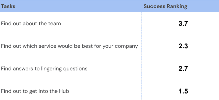
Key Findings:
Navigation success: Average confidence score was 8.3/10, showing overall usability alignment.
Service page confusion: Users struggled to understand the content and lacked motivation to scroll.
Scrolling motivation: Many stopped at the hero section, missing critical information below.
Actionable Changes:
Added visual cues, balanced text and visuals, and stronger calls-to-action to encourage scrolling.
Introduced multiple pathways to key products and the Hub to reduce friction.
High-Fidelity Wireframes & Prototype 🎨
With insights from testing and stakeholder feedback, we developed high-fidelity designs for all major pages:
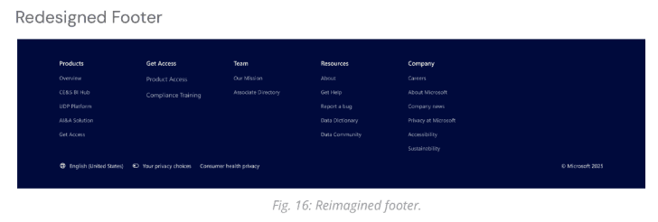
Navigation Bar & Footer:
Consolidated links, improved hierarchy, and introduced a footer for easier access to resources.
Before:
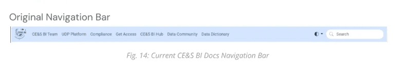
After:
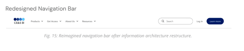
The original site did not have a footer so we created one:
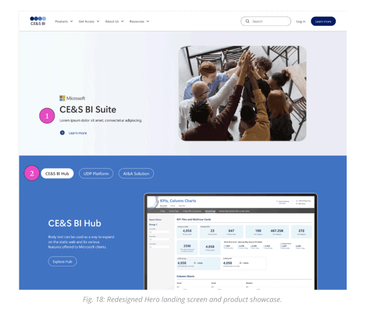
Landing Page:
Hero banner, product showcase, and service carousel optimized for clarity and engagement.
Before:
After:
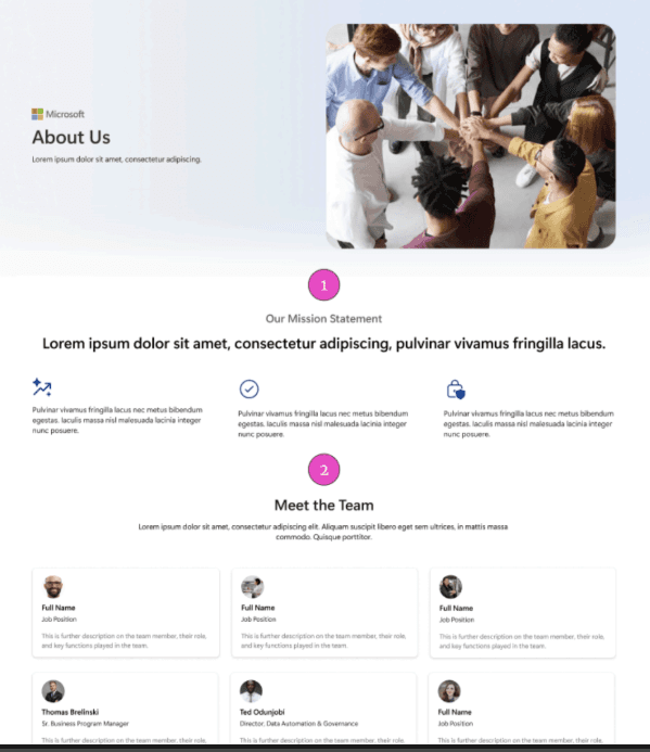
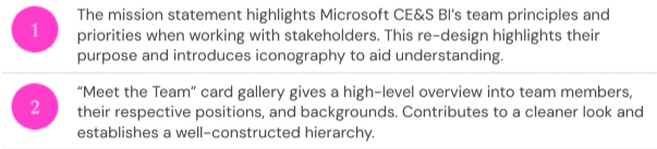
About Page:
Team mission, principles, and “Meet the Team” cards.
Before:
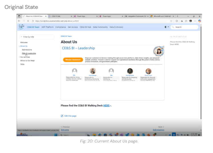
After:
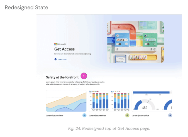
Get Access Page:
Clear product access steps and CTAs.
Before:
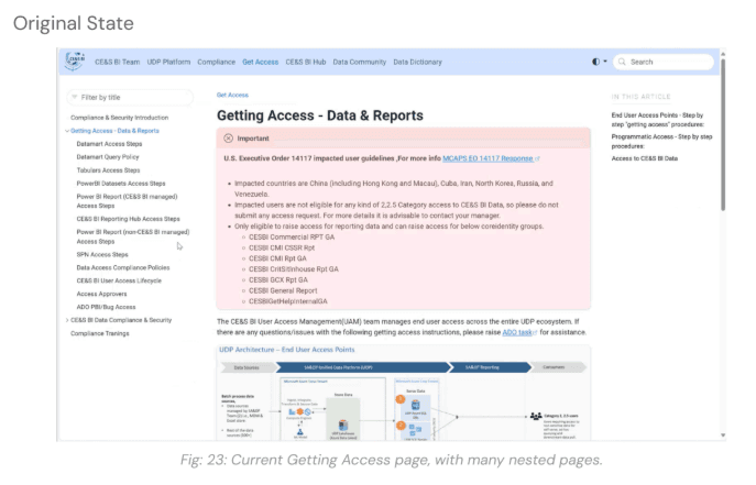
After:
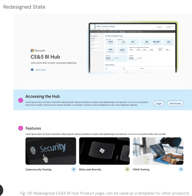
Product Pages:
Highlights demos, resources, and access points.
Before:
After:
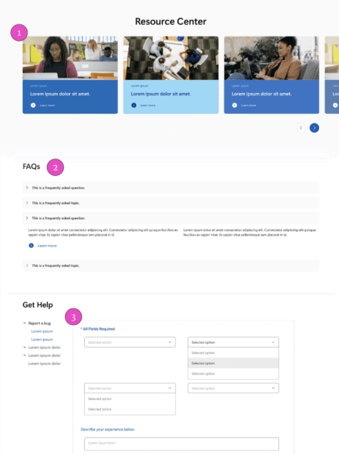
Resources Page:
Centralized FAQs, documentation, and bug reporting.
Before:
After:
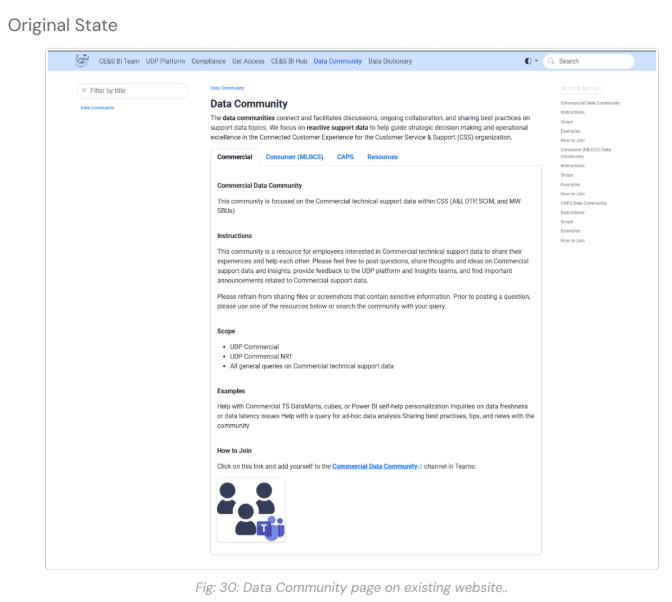
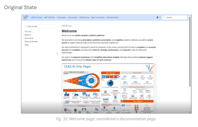
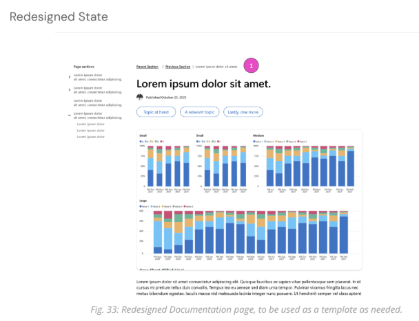
Documentation Page:
Standardized headers, section headings, and navigation for nested pages.
Before:
After:
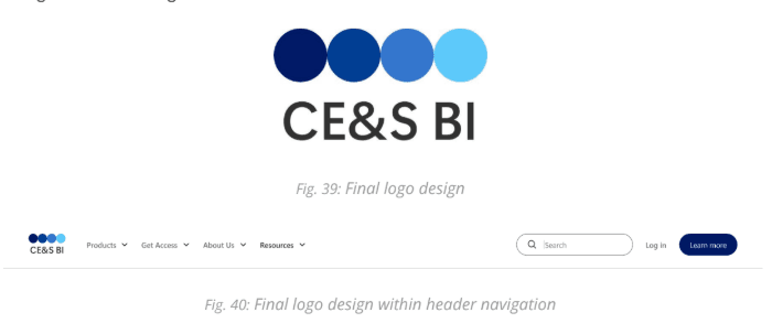
Logo Redesign ✨
We updated the CE&S BI logo to match the refined UI:
Inspired by bar/mountain graphs and existing Microsoft branding.
Iterated through multiple concepts, emphasizing simplicity and minimalism.
Final logo features a horizontal layout, a simplified graphic, and a consistent color palette, ensuring it integrates seamlessly into the header without competing with data visualizations.
Original logo:
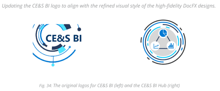
Redesigned logo:
Milestone 2 Outcomes ✅
Activities:
Sketching & Wireframing
Mid-Fidelity Prototyping & Iteration
Usability Testing
High-Fidelity Design
logo Update
Deliverables:
High-Fidelity Prototype of CE&S BI Docs
Design Documentation (colors, typography, grid system)
HTML/CSS code ready for development
Logo redesign handoff
Milestone 3: CE&S BI Hub Revamp 🌐
Goal:
Improve navigation and discoverability by addressing usability issues and developing a mid-fidelity prototype of the Hub.
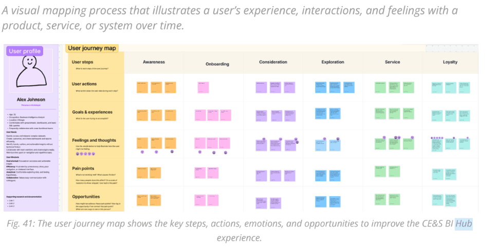
User Journey Mapping 🗺️
Mapped persona Alex Johnson’s actions, goals, emotions, and friction points.
Key Takeaways:
Acronyms were confusing → Opportunity: add glossary
Navigation was difficult → Opportunity: simplify layout, add quick access menu
Reports not easily accessible → Opportunity: favorites tab
Insights clarified where the Hub created friction and guided usability improvements
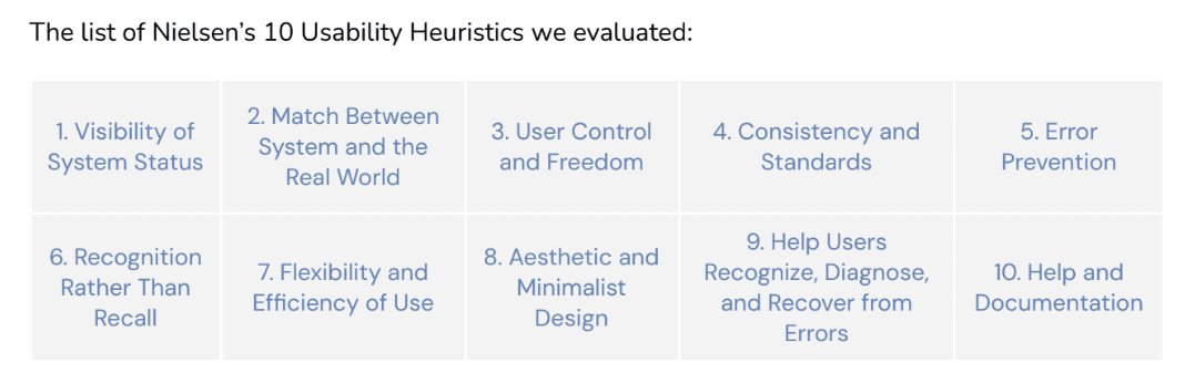
Heuristic Evaluation 🔍
Evaluated Hub against Nielsen’s 10 usability principles
Issues Identified:
Unclear feedback and error handling
Inconsistent and cluttered interface
Inefficient navigation and workflows
Hidden or unhelpful support resources
Outcome:
Findings informed revised site map and guided design decisions to simplify workflows and reduce cognitive load
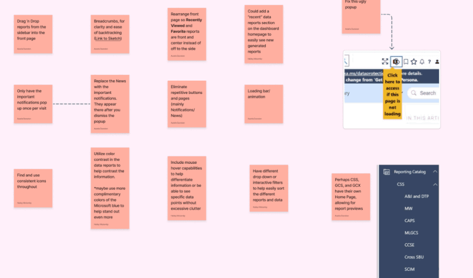
Feature List 📋
Synthesized research insights and best practices from other sites
Key Features:
Smooth navigation: breadcrumbs, favorites, recents, filtering options
Enhanced interaction: hover effects, drag-and-drop, loading animations
Consistent visuals: color contrast, iconography, reduced clutter
Provided actionable guidance for creating a user-centered, cohesive, and scalable Hub
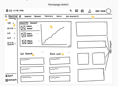
Sketching ✏️
Focused on landing page layout and report accessibility
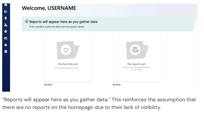
Initial design: Favorites & Recents widget, but first time users couldn’t see reports or alerts
Final approach: Inspired by Google Drive, clarified reporting catalog hierarchy for easier discovery
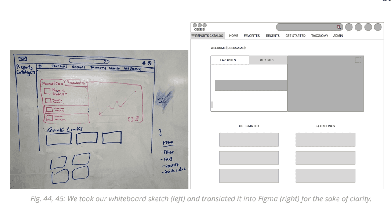
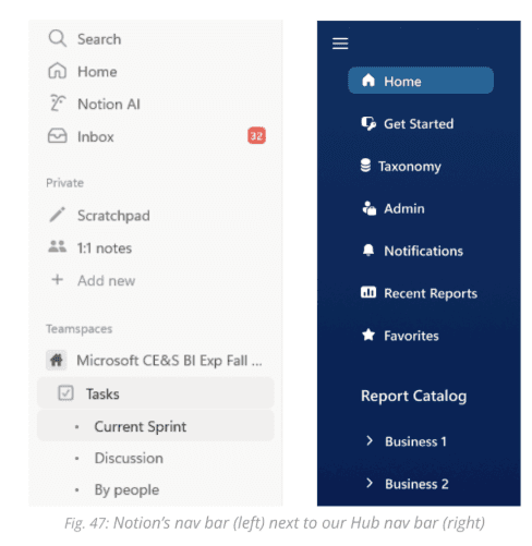
Starting Mid-Fidelity Wireframing 🖥️
Refined landing page and navigation using DocFX design guidelines
Key Decisions:
Sidebar expanded by default
Navigation inspired by Notion for familiarity
Alerts and key content emphasized
Mid-fidelity wireframes clarified layout, hierarchy, and navigation before high-fidelity design
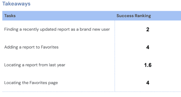
Usability Testing ✅
Five participants role-played as employees accessing reports
Tasks Tested:
Find a recently updated report
Add a report to Favorites
Locate a report from last year
Access Favorites page
Insights:
New users struggled to find reports
Confusing language reinforced the impression that no reports existed
Collapsed sidebar caused confusion
Feedback reinforced need for clear visibility, simple language, and obvious navigation cues
Key Design Adjustments Based on Usability Testing:
Increase visibility of reports on the New User Homepage so first-time users can immediately see content
Correct inconsistent and misleading language on the New User Homepage to reduce confusion
Make the sidebar expanded by default to improve discoverability of navigation options
Final Mid-Fidelity Designs 🎨✨
The redesign focused on consistent, intuitive, and scalable experiences for first-time and returning users. Key updates included:
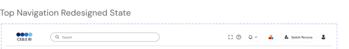
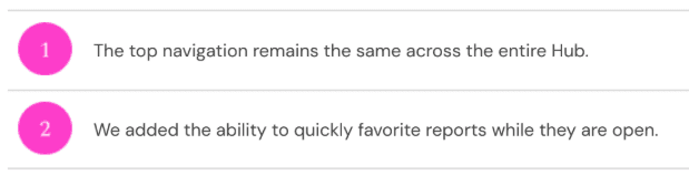
Persistent global top navigation for search, notifications, help, persona switching, and profile access.
Before:
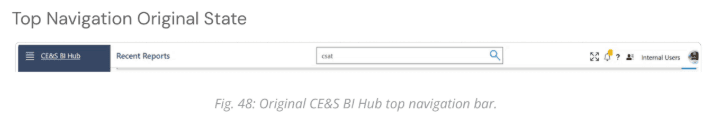
After:
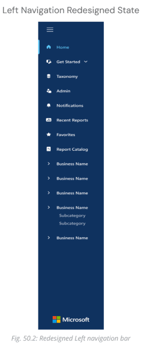
Left navigation reordered by frequency of use, with redundant pages nested under “Get Started.”
Before:
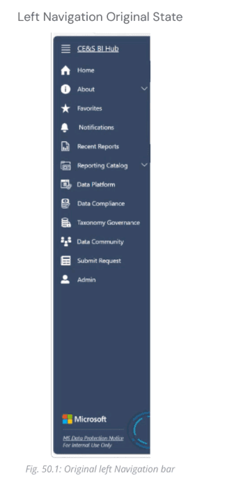
After:
Landing page prioritized reports, with Popular Reports for new users and a clearer structure for recents and favorites.
Before :
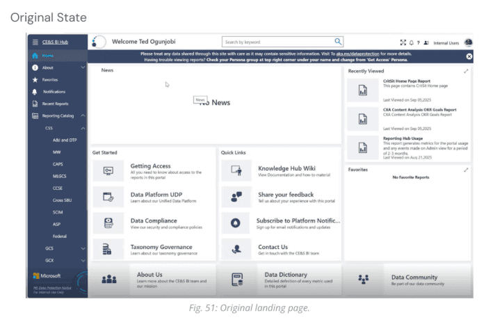
After :
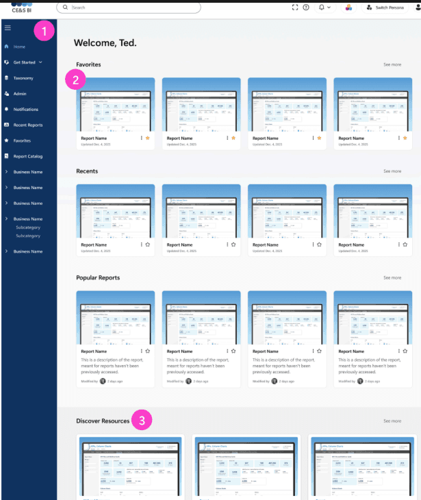
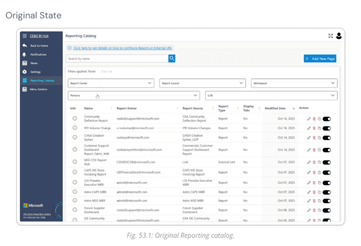
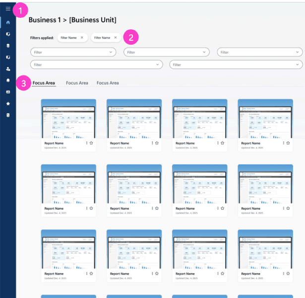
Reporting Catalog shifted to a card-based grid layout, supporting visual recognition and efficient filtering.
Before:
After :
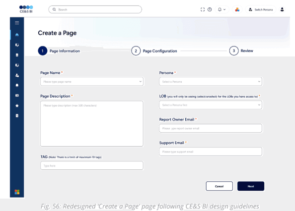
Report Creation Form improved clarity with labels, helper text, and progress feedback.
Before:
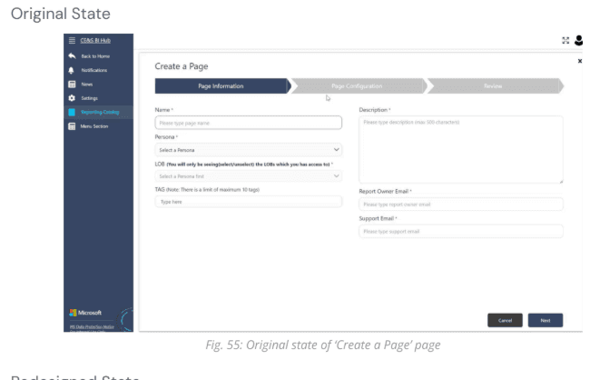
After:
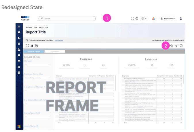
Report Housing Page separated global navigation from report-specific actions, making icons contextually relevant.
Before:
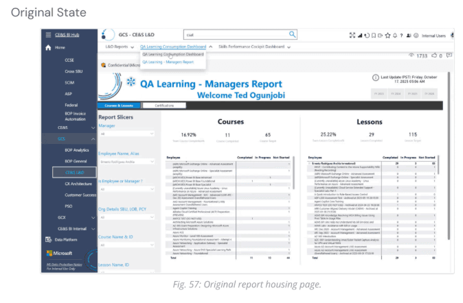
After :
Summary of Milestone 3 🏁
Activities:
Feature list creation
Journey mapping
Heuristic evaluation
Sketching
Mid-fidelity wireframing
Usability testing
Outcomes:
Validated design choices
Revealed remaining pain points (sidebar visibility, confusing language)
Clarified layout, hierarchy, and navigation while aligning with DocFX styles
Usability insights informed iterative improvements
Made reports easier to find by placing them front and center with previews, reducing access from up to 5 clicks to as few as 1
Limitations:
Time constraints
Limited to sponsor walkthroughs and screenshots, no direct access to live Hub
Participants were role-playing users, not actual Hub users
Prototype remained mid-fidelity; detailed interactions not fully tested
Next Steps:
Advance designs to high-fidelity in Figma
Test with actual CE&S BI users
Export HTML/CSS for development
My Contributions on this Project👩💻
🔍 Research: Desk Research, Heuristic evaluation, user journey mapping, Interview, cognitive walkthrough
🎨 Design: Whiteboard Sketching, Paper Sketching, Wireframes, Mid-fidelity designs, Custom icon
🤝 Collaboration & Project Management: Leading multiple weekly sponsor meetings, Sponsor meeting note taking, Milestone slide updates, Final presentation, Documentation, Transition Document.
Impact 🌟
This project improved discoverability and navigation across the CE&S BI Docs site and Hub by reducing friction in key user flows for over 20,000 individuals. Clearer language, consistent navigation, and improved visual hierarchy made the platform easier for first time and returning users to understand. The final designs were delivered with documentation and development ready assets and are currently being implemented by Microsoft.
Reflection 💭
This project taught me how to design within real enterprise constraints while staying focused on user needs. Limited platform access required me to rely heavily on research, walkthroughs, and usability testing to guide decisions. I learned that clarity, visibility, and simple language often have more impact than adding new features. Leading sponsor meetings and translating research into actionable design decisions strengthened my confidence and prepared me for professional UX environments.


