Company:
OFS
Year:
2025
Duration:
1 Months
Overview
The CRM search and header experience at OFS is a core navigation tool used daily by employees across sales, operations, and management. Despite its importance, the experience required redundant filtering, relied on inconsistent naming, and forced users to manually adjust dropdowns even when working within specific tabs, slowing down everyday workflows.
I led the redesign of the CRM search and header to reduce friction, align system behavior with user expectations, and modernize the interface. Through interviews, usability testing, and multiple design iterations, I introduced a context aware search experience, simplified navigation, and a cleaner, more scannable layout.
The final design was adopted company wide, improving search clarity, accuracy, and efficiency across the organization.✅✨
Problem Statement📝
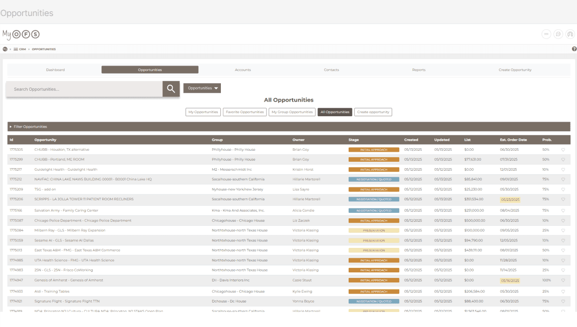
The CRM search required users to manually select filters from a dropdown even when already in the relevant tab, creating friction, confusion, and slower workflows. The outdated interface also made it difficult for employees to quickly find and verify opportunities, contacts, or accounts.
What Wasn’t Working ⚠️
🔄 Redundant search filters – Users had to manually reset filters instead of the search matching the active tab.
❌ Confusing dropdown behavior – Dropdowns didn’t update with navigation, breaking expectations.
🖼️ Visual clutter – Outdated layout created noise, making results harder to track.
🏷️ Naming inconsistencies – Acronyms, alternate spellings, and inconsistent formats made search unreliable.
🐢 Slow, inefficient workflows – Users avoided the search bar and navigated manually, reducing efficiency.
Research Methods🔍
To better understand user pain points and inform design decisions under strict time constraints, I conducted:
3 User Interviews with employees of all different positions who use the CRM search every day.
3 Usability Tests on the existing CRM search interface.
Usability Testing and Interview Findings🖥️🗣️
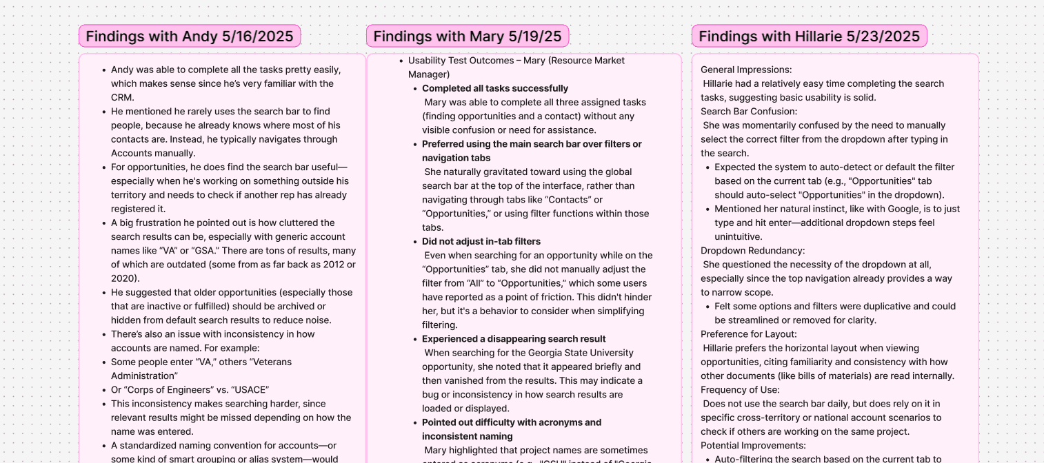
Andy
25+ years of sales experience
Completed tasks easily due to deep CRM familiarity
Rarely used search for contacts
Used search primarily to check opportunities outside his territory
Found search results cluttered with outdated or inactive entries
Noted inconsistent naming such as “VA” vs. “Veterans Administration”
Suggested standardized naming or archiving to reduce noise
Mary
Resource Market Manager
Completed all tasks without major issues
Defaulted to global search over filters or navigation tabs
Relied on search even when inside the Opportunities tab
Experienced a disappearing result when searching Georgia State University
Said inconsistent naming and acronyms slowed verification
Suggested shorthand recognition such as “DC” returning Washington, DC
Felt persistent filters could frustrate reps working quickly
Hillarie
Sales Representative
Completed tasks with minimal difficulty
Expected search to adapt to the current tab context
Found dropdown filters clunky and unnecessary
Preferred a horizontal layout for scanning opportunities
Found creating a new end user within Accounts frustrating
Synthesis: Key Themes🔑✨
After synthesizing Interview and usability findings, several clear themes emerged.
Pain Points
Redundant and confusing dropdown filters
Inconsistent naming across accounts and opportunities
Cluttered interface with outdated results
Unreliable search behavior, including disappearing results
Mismatch between user expectations and system behavior
User Needs
Context aware search behavior
Cleaner, more scannable result layouts
Faster confirmation of the correct record
Support for acronyms and shorthand
Fewer steps and clearer visual hierarchy
Opportunities
Replace manual filtering with smarter defaults
Introduce both global and scoped search behavior
Work with engineering to standardize naming conventions
Refresh the UI while keeping it lightweight and efficient
Design Process🎨🛠️
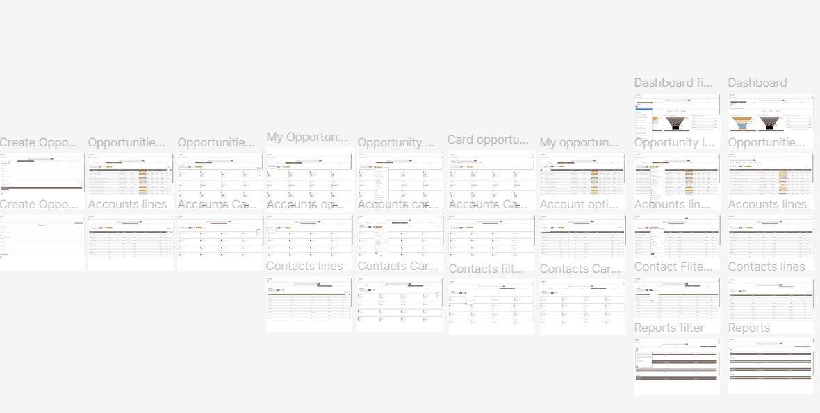
I created three rounds of mockups, iterating based on user feedback and usability test outcomes:
Initial Mockup iteration
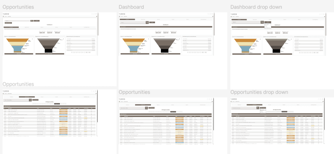
Second Mockup iteration
Third Mockup iteration
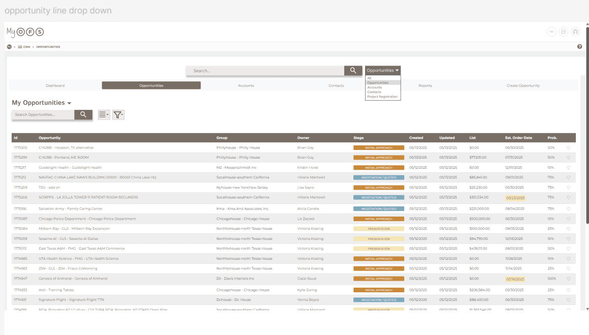
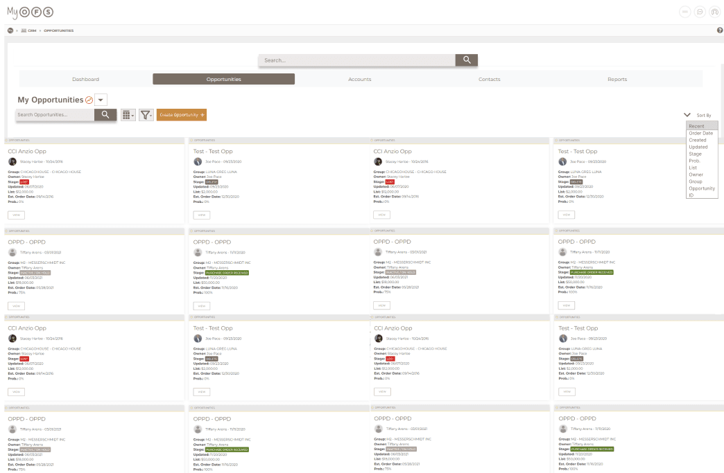
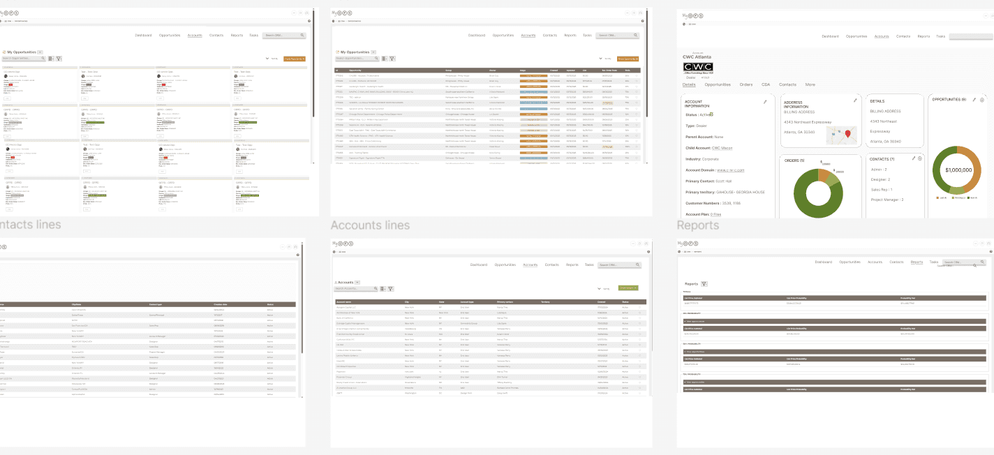
Introduced dual search options, a cleaner interface, new sorting features, and the ability to switch between card and line views.
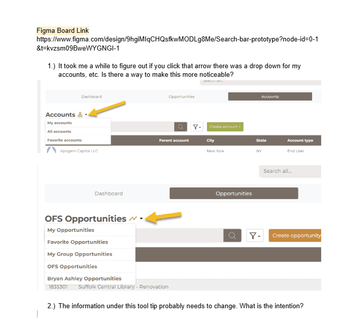
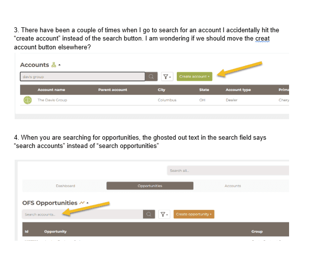
This mockup was shared with all OFS employees and later refined based on user feedback collected through a public suggestion document, which is included at the end of this case study.
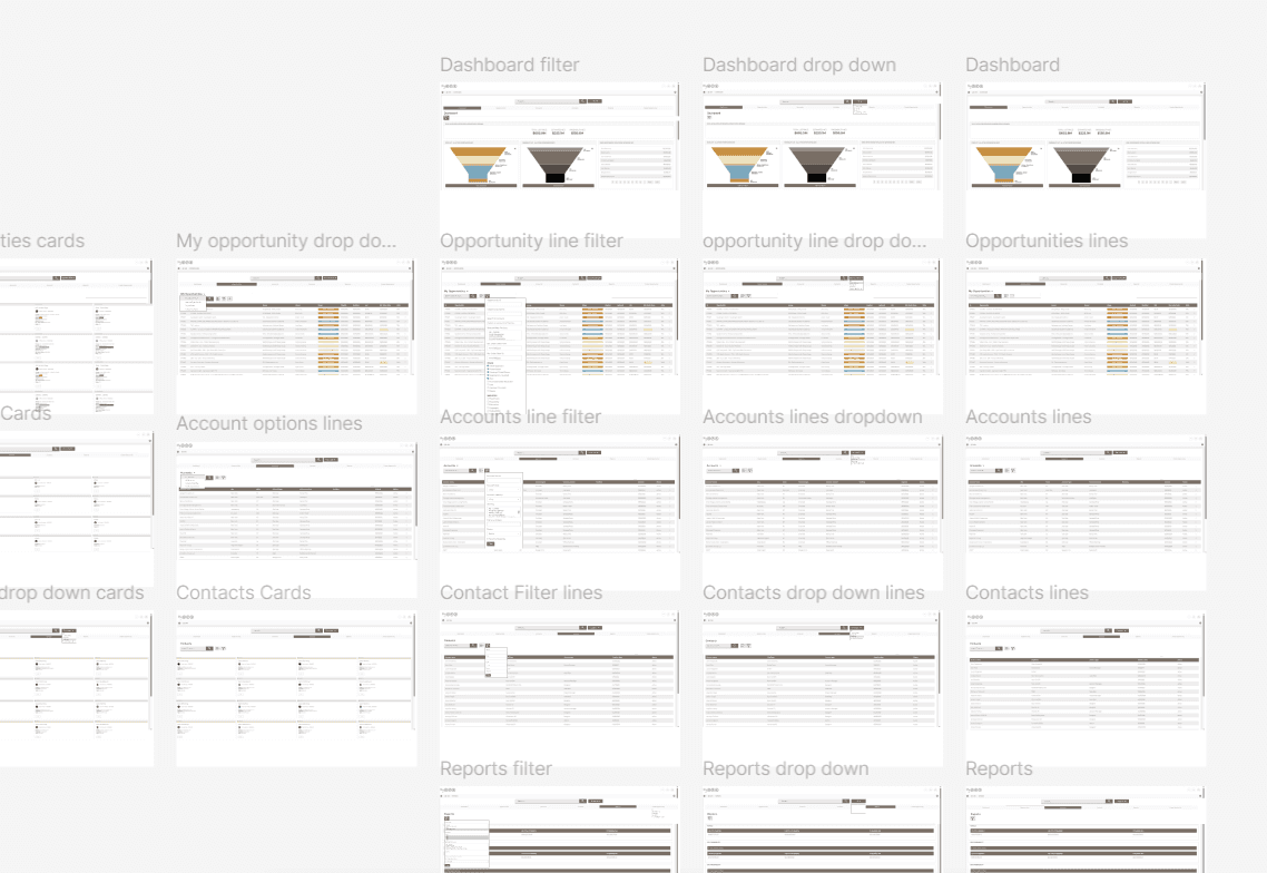
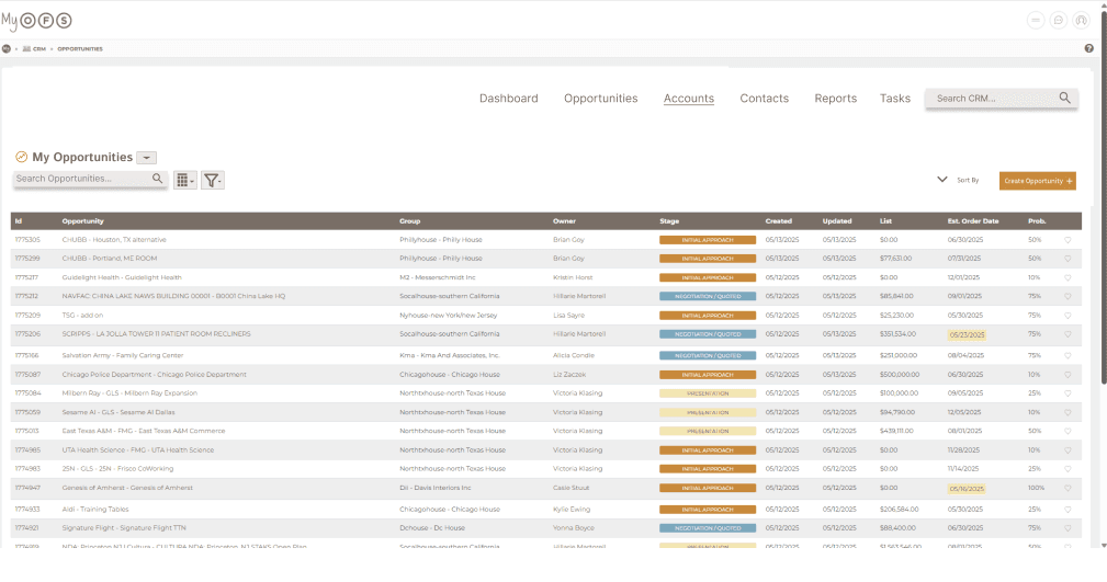
Final Mockup
The final design came together after incorporating feedback on Mockup 3 from OFS employees post launch. Several refinements made the interface cleaner and more intuitive:
A more obvious dropdown as some individuals said it was hard to find.
A minimal top menu that reduces visual clutter and keeps the focus on key content.
The universal search moved to a smaller placement in the corner, since users preferred the more specific, tab-level search for everyday tasks.
These final adjustments brought the design to a place where it felt not only modern and visually clean, but also deeply aligned with how sales reps actually work day to day.
Before and After Comparison🔍➡️✨🚀
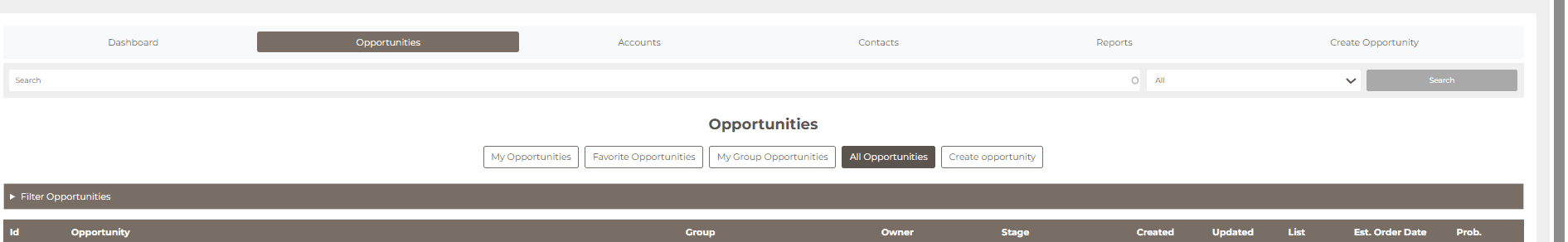
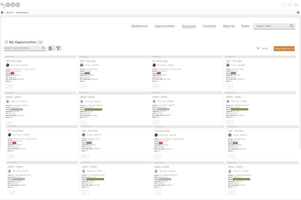
Before (Old Design):
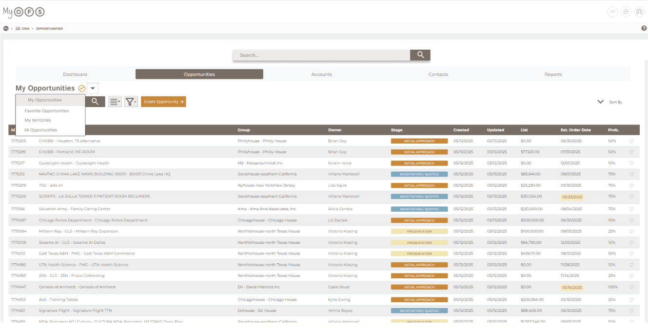
Dropdown filter required manual adjustment.
Visually cluttered and unintuitive.
User confused by the drop down and filter
After (New Design):
🔎 Dual search options: global search or scoped search within current tab
🎨 More visually appealing and streamlined
♻️ Reduced redundancy by merging overlapping search/filter functions
🧭 Simplified navigation, improving efficiency and reducing errors
⏱️ Minimized clicks required to create a new project, speeding up workflows
Impact💥
Improved efficiency in daily workflows for employees.
Reduced confusion and cognitive load during search tasks.
Increased user satisfaction, as confirmed by post implementation feedback.
Demonstrated the value of UX research and iterative design in real world business systems.
Reflection💭
Reinforced the value of user research and iterative prototyping to solve both functional and UX challenges
Showed how small interface changes, like search improvements, can significantly boost workflow efficiency and user satisfaction
Highlighted the importance of cross-functional collaboration with engineers to implement practical, scalable solutions
Strengthened skills in translating user insights into actionable design decisions
Demonstrated the impact of aligning design with real world workflows to support business goals
Next Steps🚀
I created a public google doc that all OFS employees have access to as a way to identify remaining pain points and opportunities for improvement, which will inform the next round of design updates.